Urvi was a small-scale household business from a Trivandrum-based family, born out of a vision to bring purely cultivated spices and homemade snacks from their village near the Padmanabhaswamy Temple to a wider audience. With its roots in purity and cultural heritage, their business needed an identity for a flea market presence that could carry the warmth of tradition while appealing to modern buyers. We stepped in to shape this transformation with a brand narrative rooted in cultural heritage, expressed through a new logo and packaging design that honored authenticity while setting the stage for growth in a competitive market.
Requirements & CHALLENGES
Urvi’s immediate need was to establish itself as more than just a household venture. The brand required an identity that could communicate its authenticity, quality, and organic roots in a way that resonated with a broader audience. The challenge lay in striking the right balance: creating a modern identity to attract new customers while retaining the traditional essence that reflected Urvi’s origin and values. Without this alignment, Urvi risked blending into the crowd of generic organic food labels rather than standing out as a brand with soul and story.
Approach & Strategy
We built Urvi’s identity by weaving together cultural depth and contemporary appeal. Every design choice was rooted in its story of authenticity and organic heritage.
-
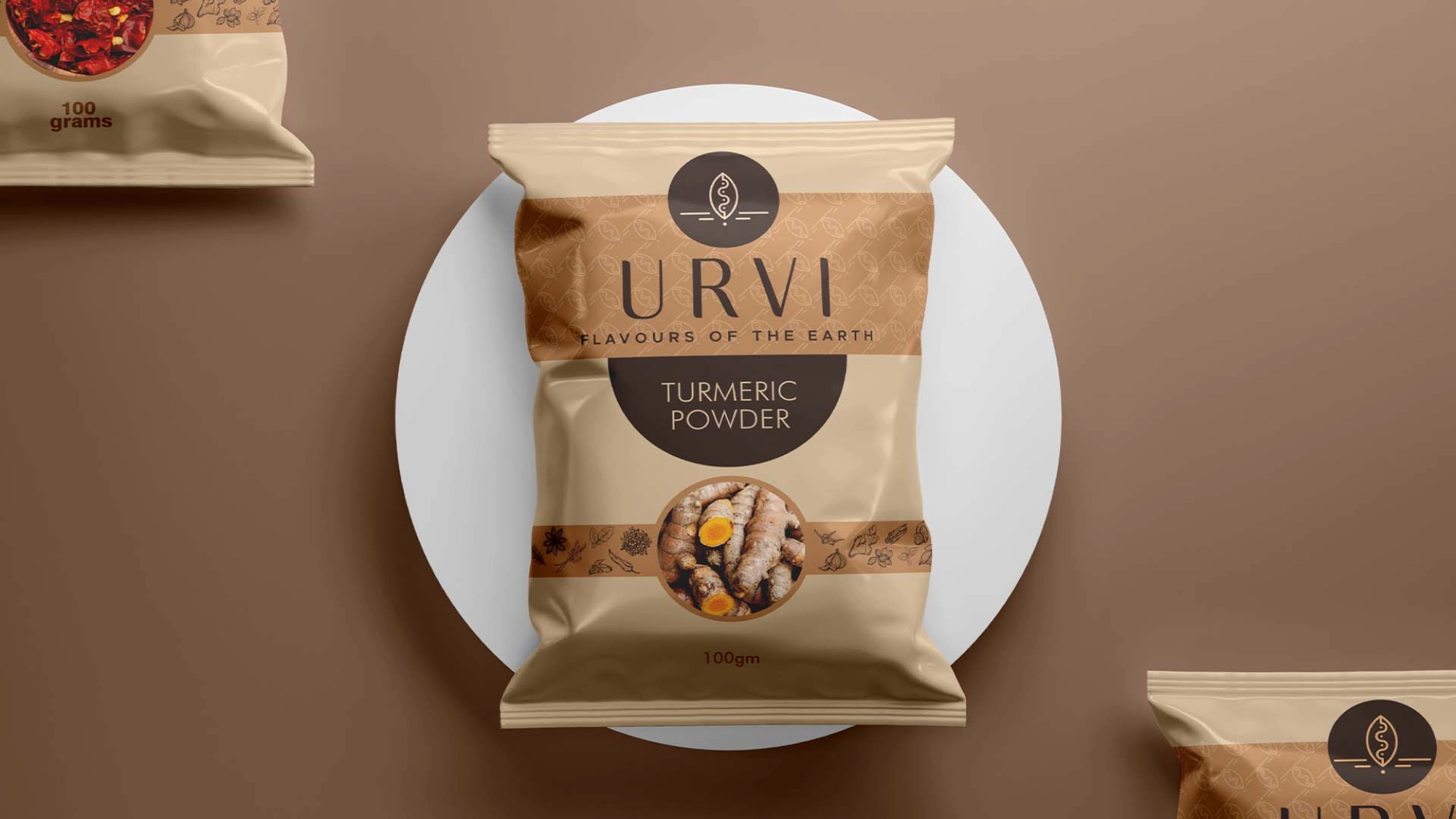
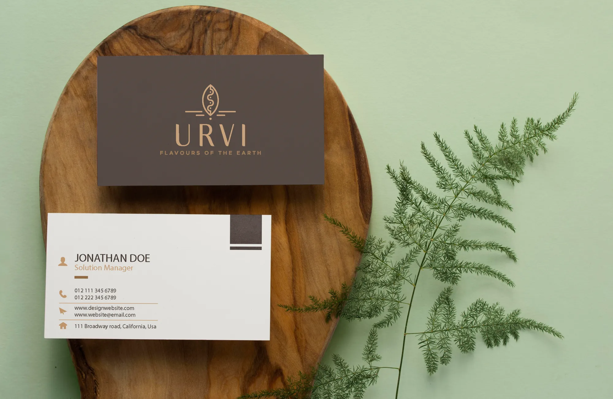
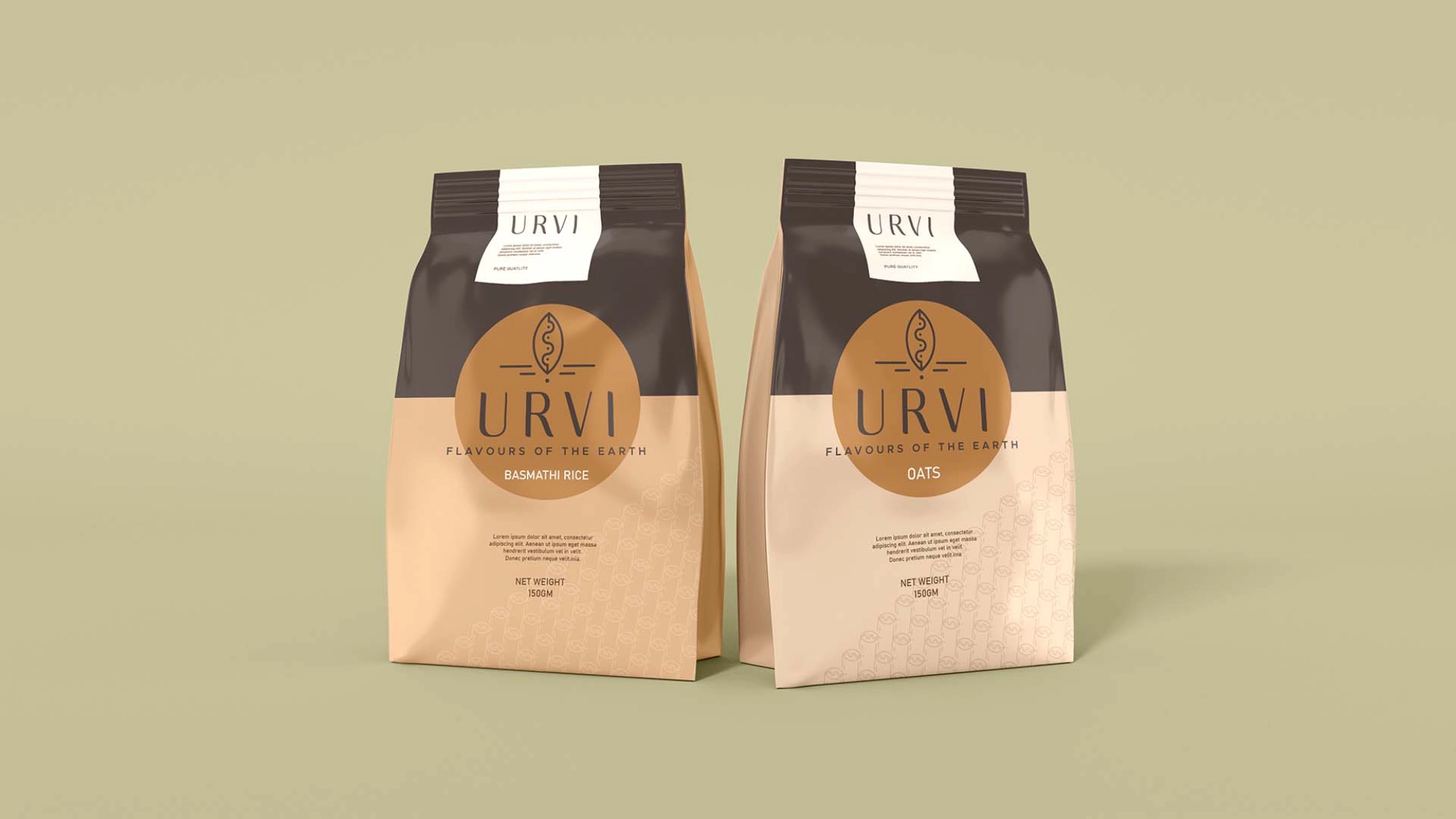
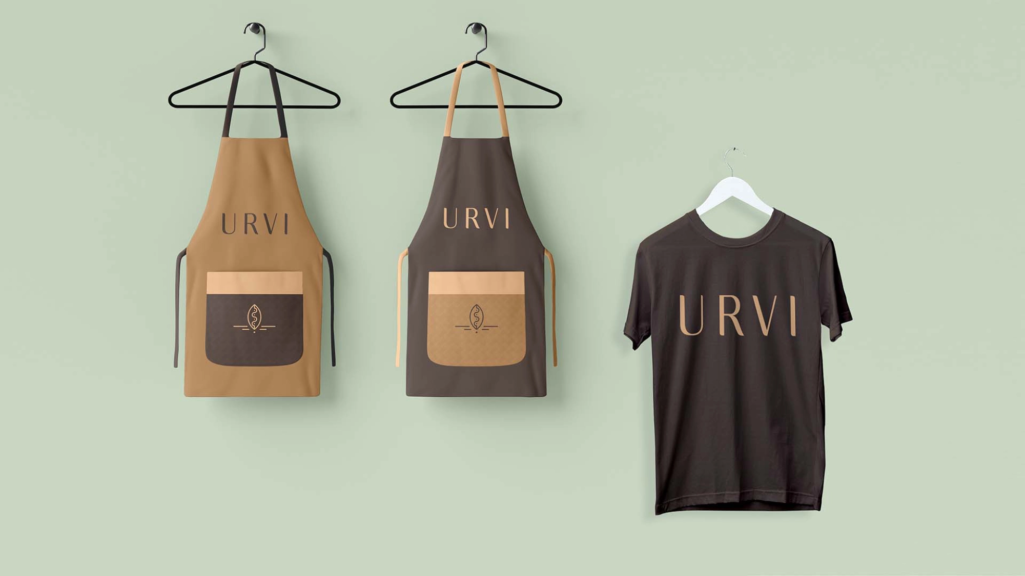
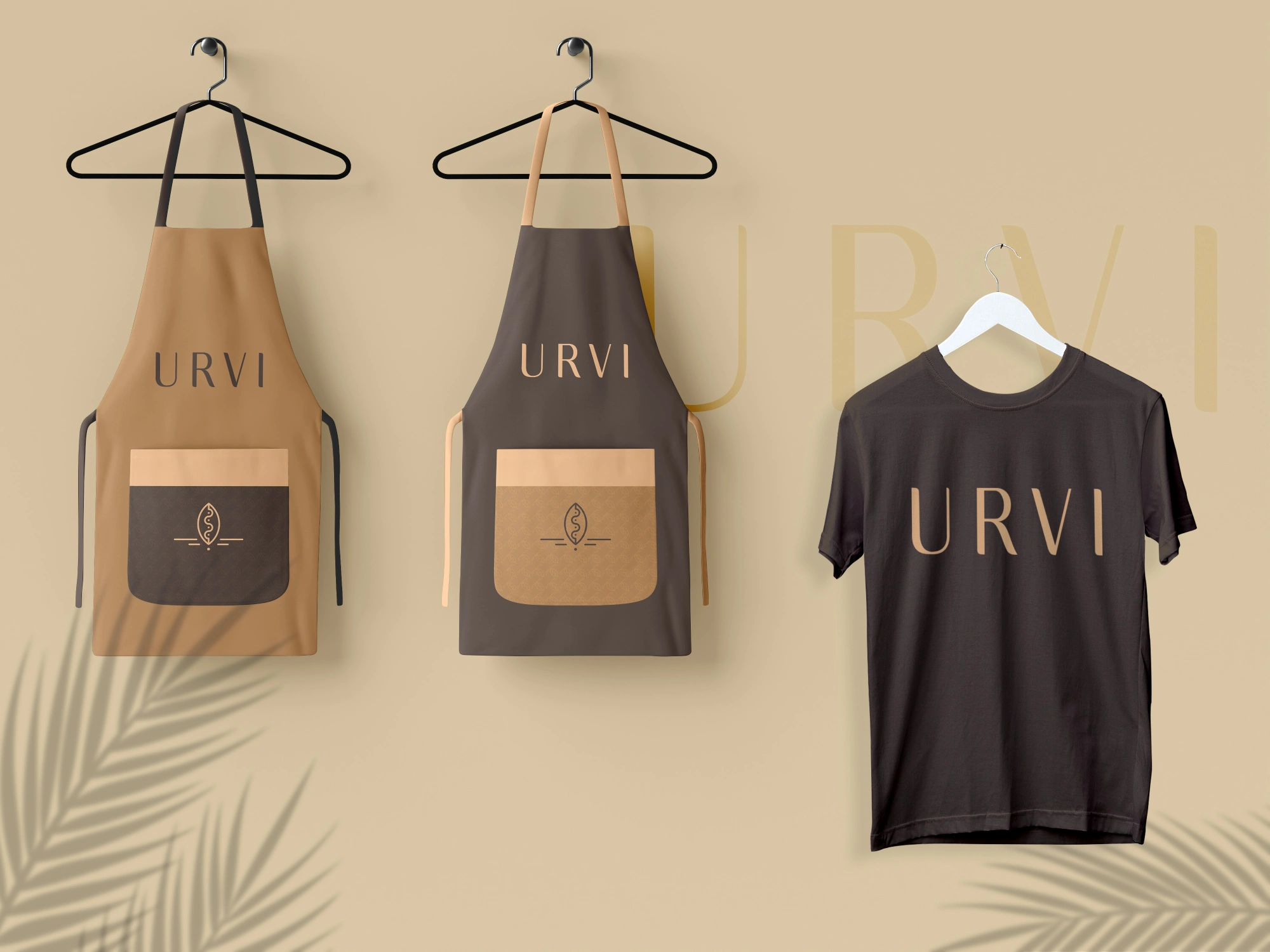
Logo Concept: Inspired by the earth (Urvi) itself, the logo used a wave-like form to symbolize the farming cycle, with an icon representing a seed planted in the soil. This became a metaphor for growth, nourishment, and vitality.
-
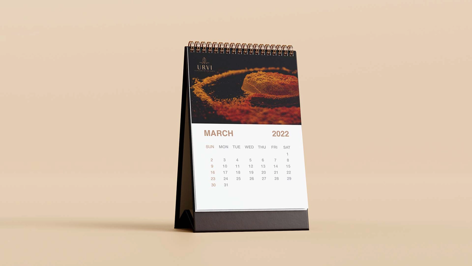
Color Palette: Warm, earthy tones mirrored the organic essence of Urvi’s products while giving it a modern, premium finish.
-
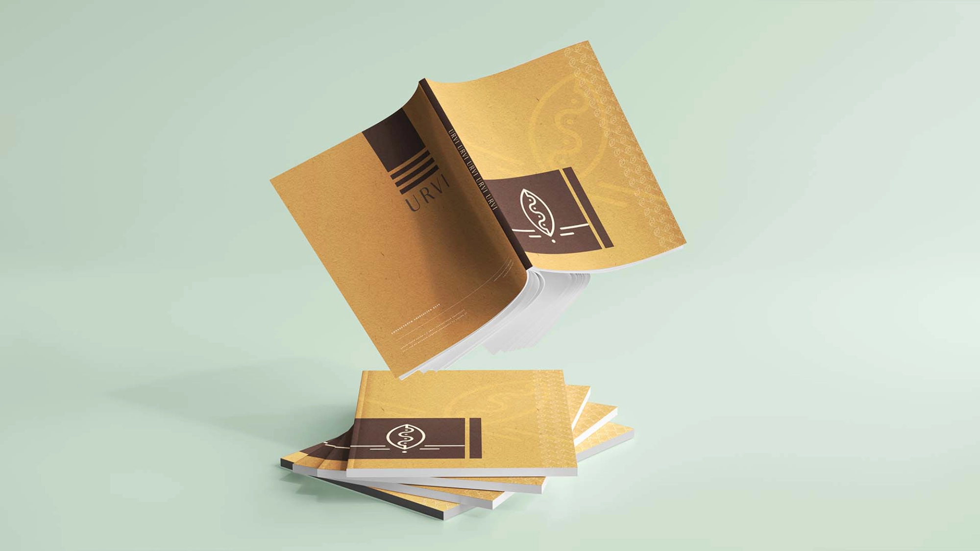
Packaging Design: Minimalistic layouts with organic textures and engaging visuals highlighted the artisanal quality of the spices and snacks. Each pack was crafted to feel authentic and consistent across the range.
-
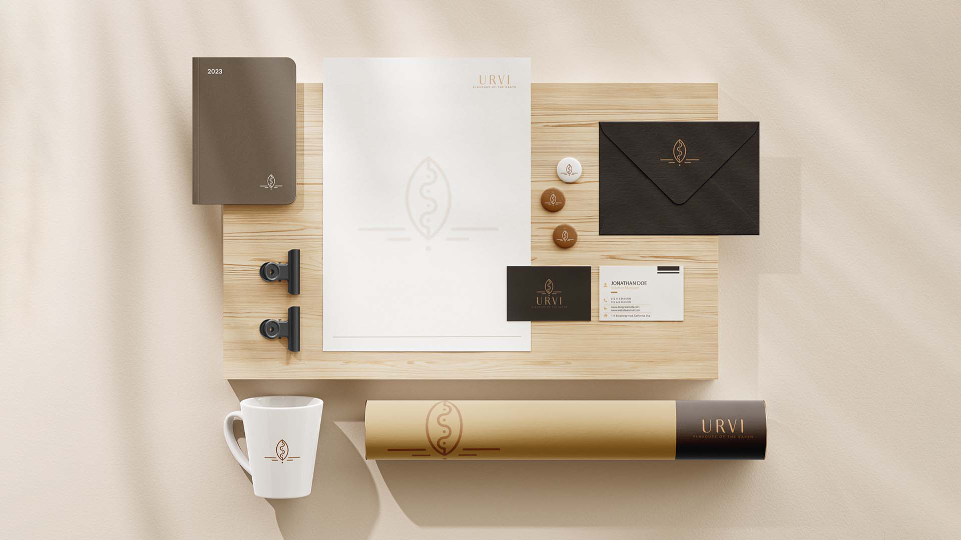
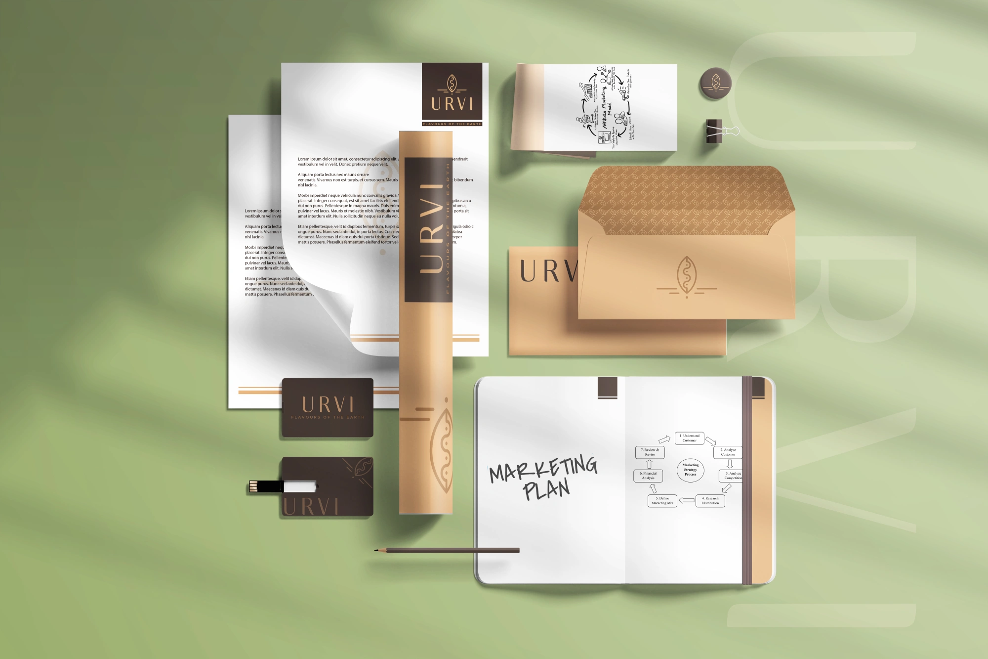
Cohesive System: We ensured the logo, colors, and packaging collectively narrated Urvi’s story — one of tradition meeting modernity.
Result
The refreshed identity gave Urvi more than just a new look; it gave the brand a voice. With its grounded yet modern visuals, Urvi was able to stand apart in a crowded market of organic products, while still carrying forward its roots in heritage and purity. The packaging amplified its artisanal charm, making every product feel like an authentic extension of the brand’s story. What began as a household initiative gradually built wider recognition, proving that thoughtful branding could turn small beginnings into meaningful growth.