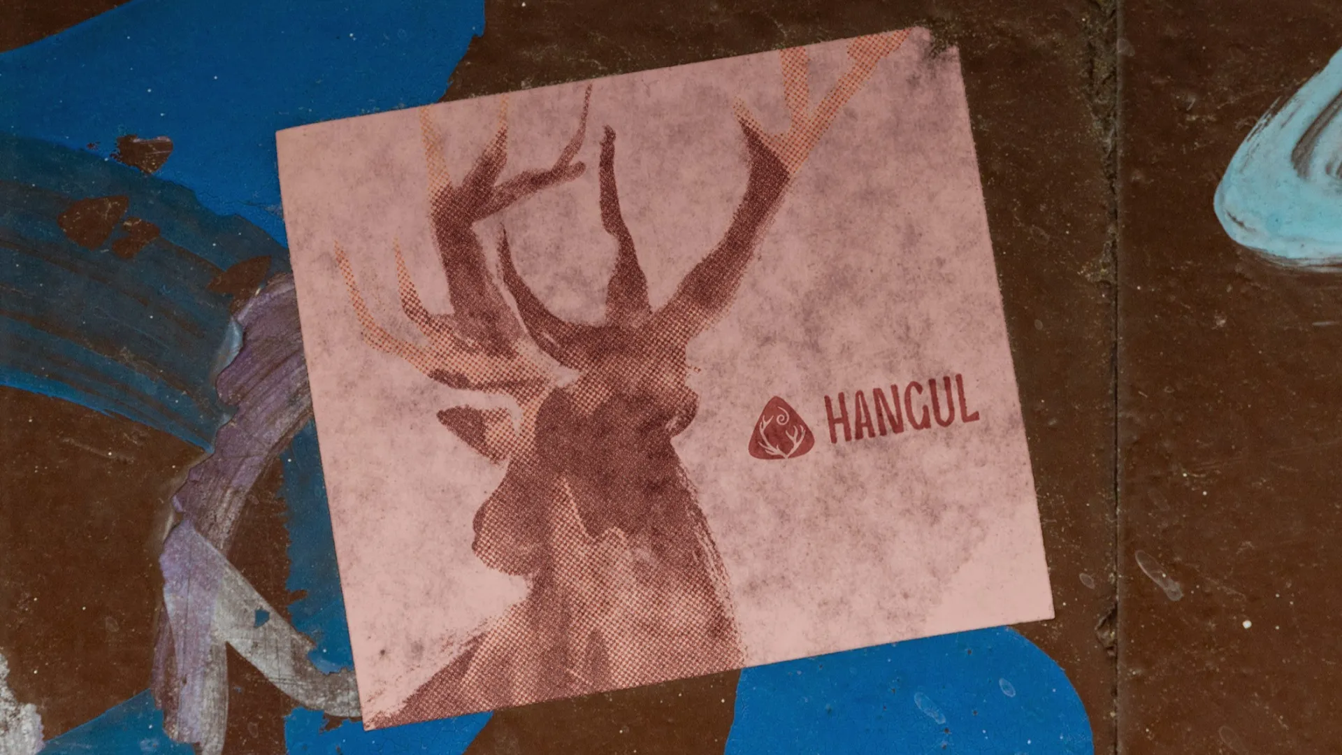
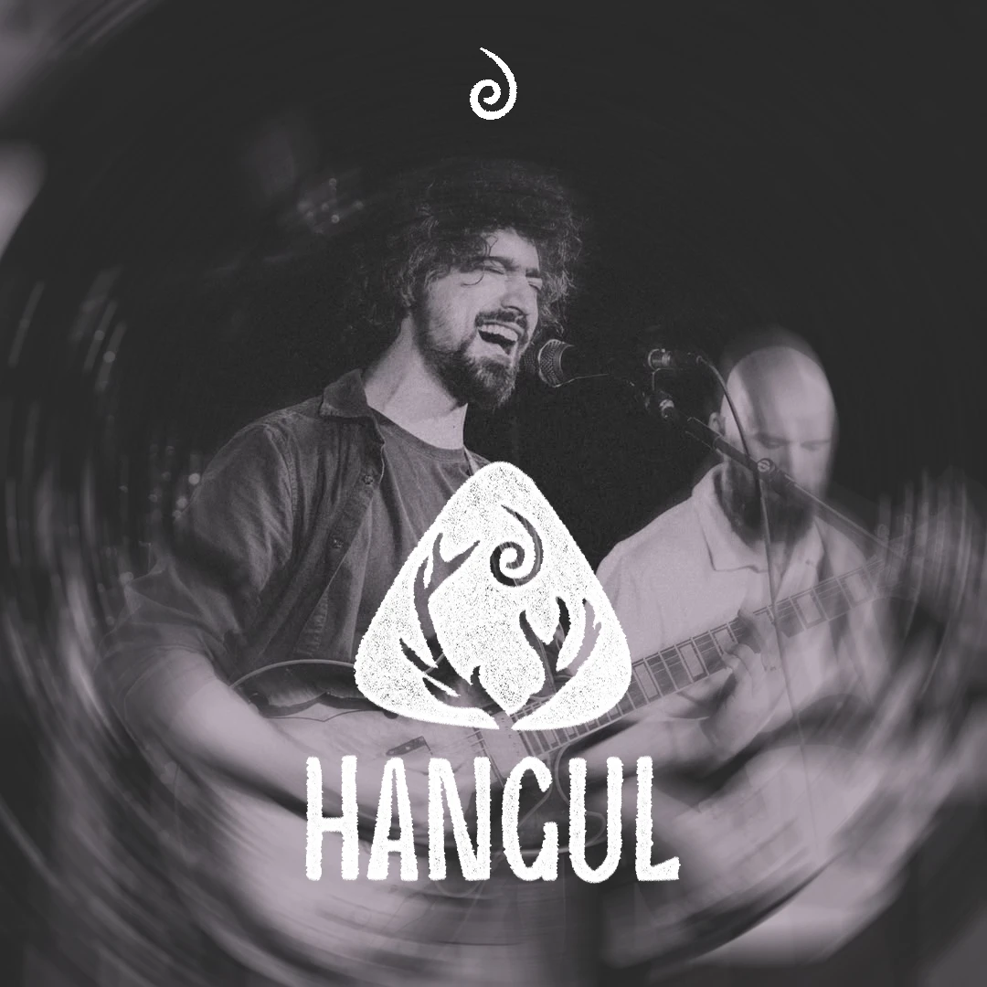
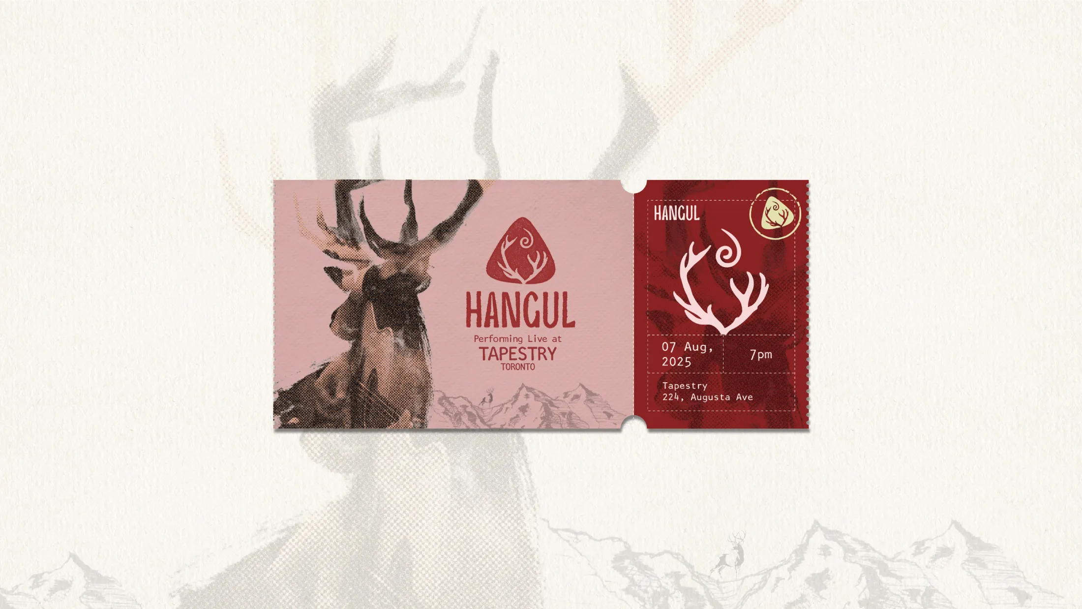
Hangul is an independent music band founded by Mir Kashif Iqbal, a Kashmiri musician who relocated to Canada to rediscover himself and his music. Born during a time of personal and artistic transition, Hangul embodies resilience, hope, and creative freedom. The name, inspired by the endangered Hangul deer, a symbol of rarity, gentle presence, and quiet strength, mirrors the essence of his independent, soulful, and enduring music, navigating a world that can often be challenging for indie musicians. Hangul needed a logo that could capture these layered narratives and emotional depth, and our design delivered a visual identity that reflects his music’s rarity, authenticity, and evocative presence.
requirements & CHALLENGEs
The logo needed to capture the cultural roots, resilience, and soulful essence of Kashif's music, creating a visual identity that resonated with its emotional depth. It had to reflect the delicate balance of strength and gentleness, much like the Hangul deer, while serving as a recognizable symbol that could connect with listeners and adapt across digital and physical platforms. The core challenge was translating these layered narratives into a single mark that felt organic, meaningful, and instantly resonant, without relying on clichés or literal depictions.
Approach & Strategy
We chose to approach this as an artist approaches a canvas, guided by feeling rather than formula. The design process focused on storytelling through symbolic visual elements, drawing inspiration from music, heritage, and the qualities of the Hangul deer.
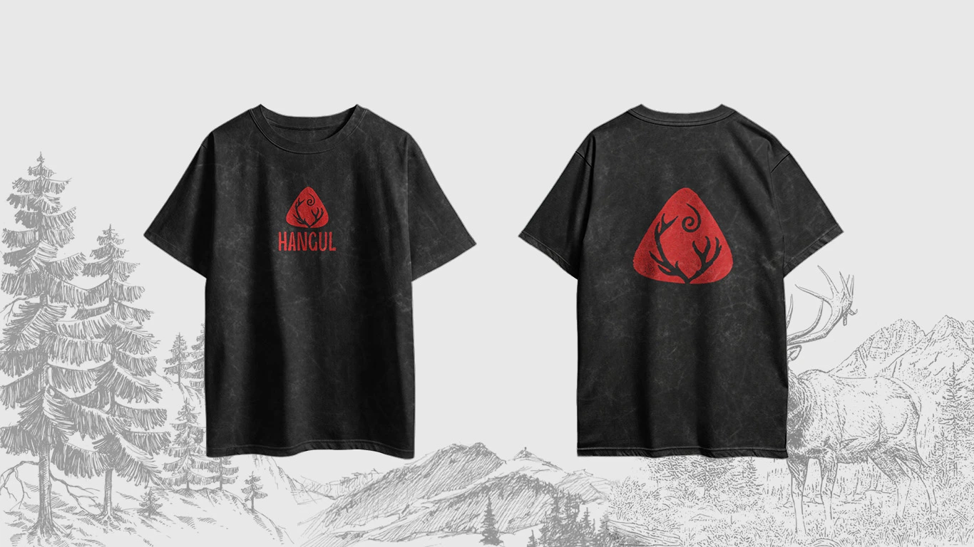
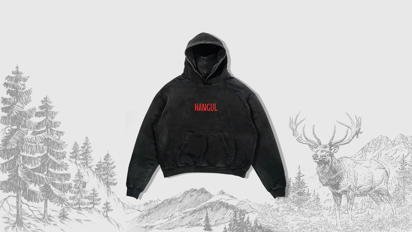
Core Shape: The logo’s foundation was inspired by a guitar pick & chord triangle, subtly shaped to echo the horns of the Hangul deer. This connected the musical aspect of his work with the symbolic heritage of Kashmir.
Swirl Element: A delicate swirl at the crown represents cycles of growth, renewal, and resilience, mirroring the independent musician’s journey and the quiet persistence of the deer.
Lines and Strokes: Every curve and line carries an emotional undercurrent, designed to convey subtlety, movement, and life. Together, these elements form a cohesive emblem that feels both natural and purposeful, inviting personal interpretation while remaining unmistakably tied to Hangul.
Result
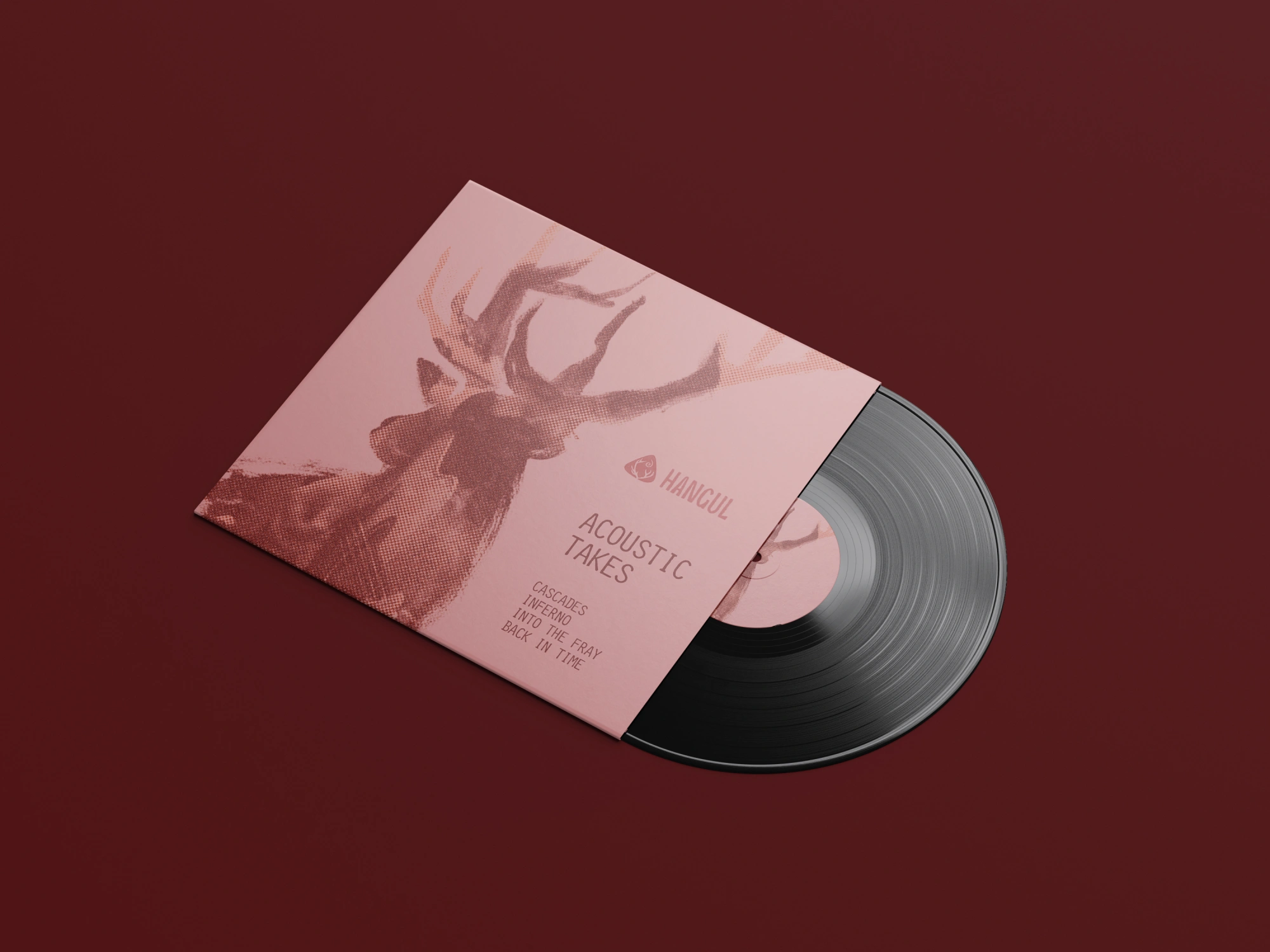
The logo captures the essence of Kashif’s soulful and rare music, weaving resilience and cultural depth into a form that feels inherently connected to his artistry. Like his music, it is raw, honest, and unforgettable.
The emblem works as a strong visual signature across digital platforms, album covers, promotional material, and live performances, establishing Hangul as a distinct, recognizable presence in the music scene.